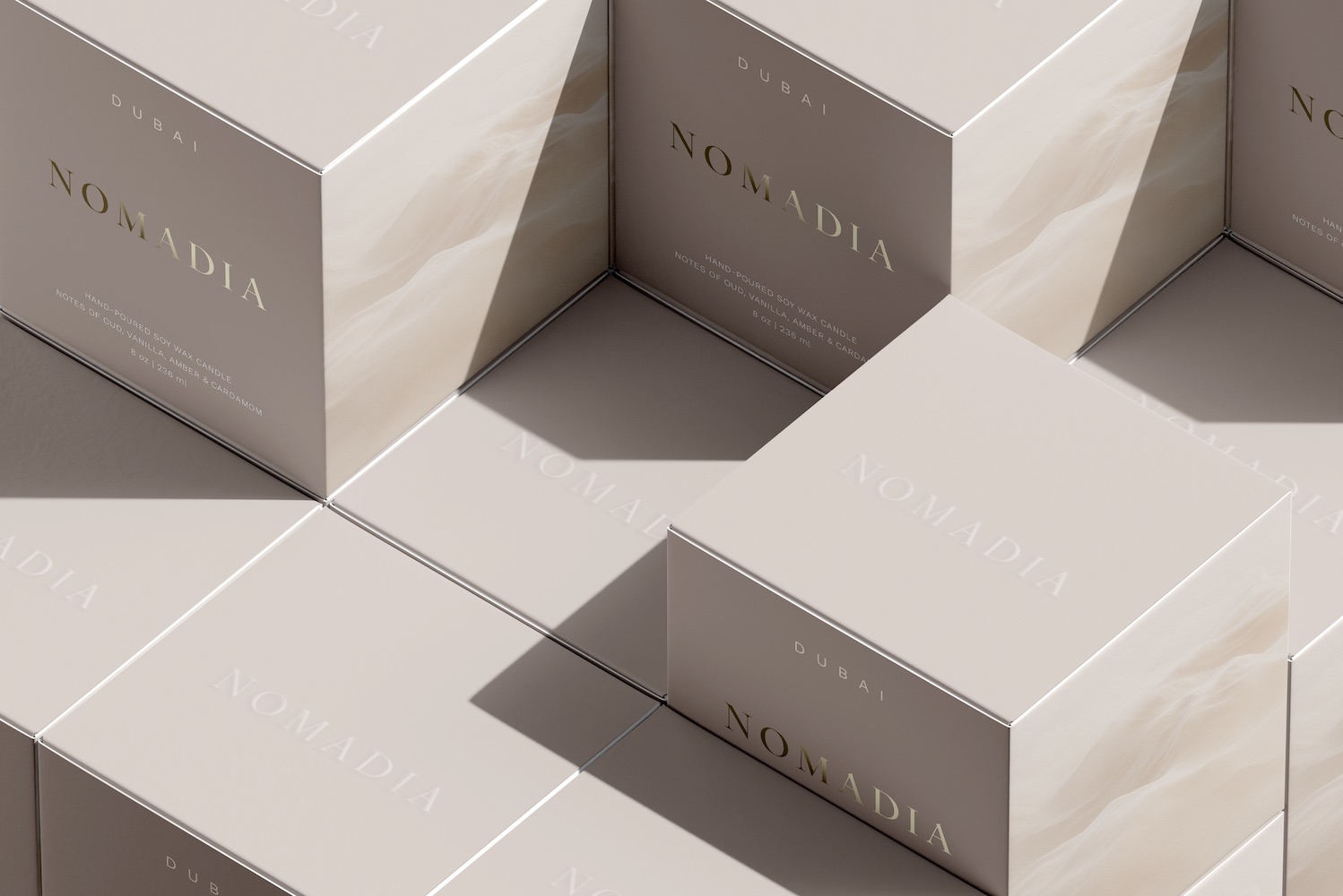
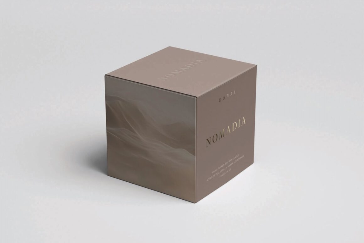
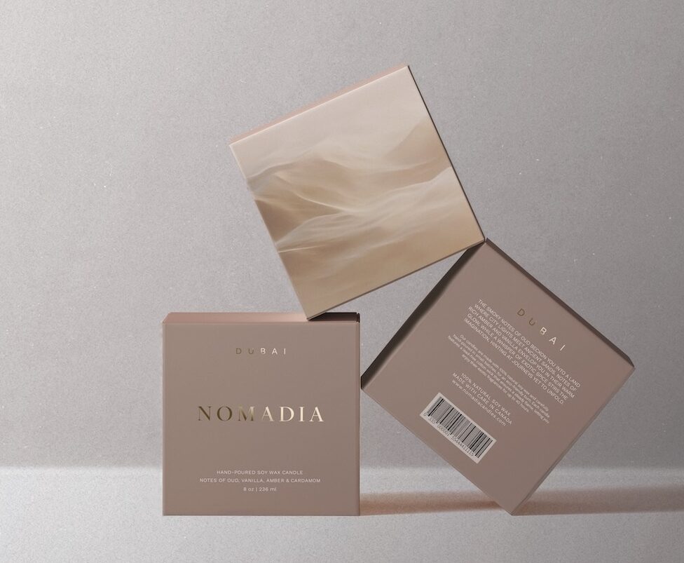
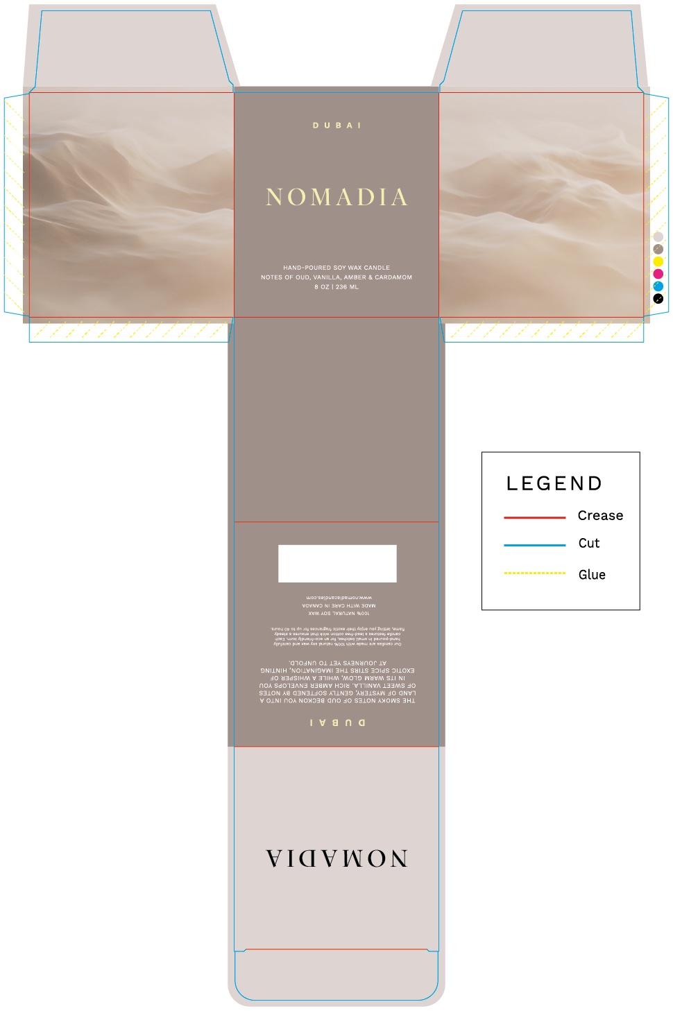
My brief limited the design to two spot colours and a gold foil accent. Rather than treating those constraints as limitations, I used them to create a subtle palette inspired by desert sands and wisps of smoke.
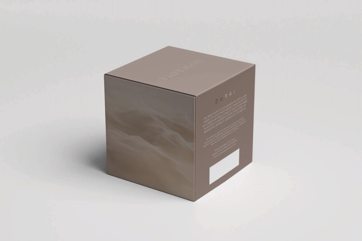
The gold foil catches the light, adding some dimension and elegance to the minimalistic design. The Nomadia name is embossed on the top of the box without any added colour, creating a tactile moment that’s only noticed when it’s felt. Clean typography and generous negative space further reinforce the brand’s premium positioning.
The layout was designed as a flexible system, allowing colour, imagery, and copy to be adjusted for other products without compromising the brand’s visual consistency.