Wander Bar Brand Application
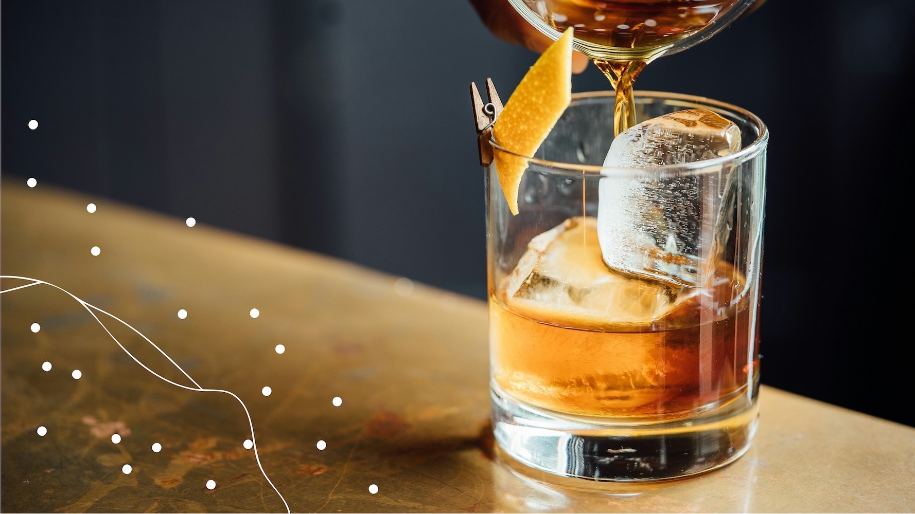
The graphic device already represents a map seen from above, and I noticed that similar patterns appear in aerial photography and macro photos of leaves.
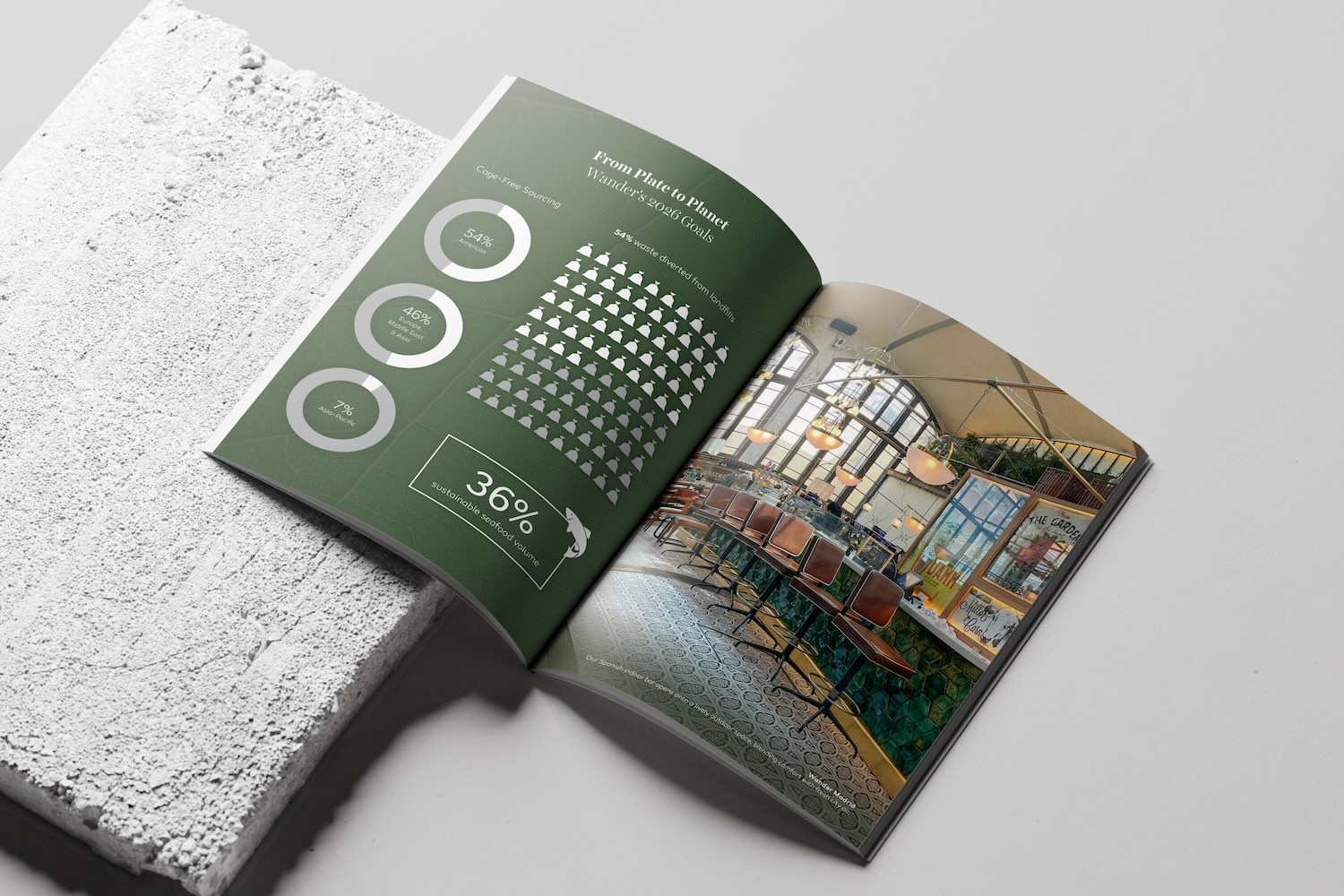
For the cover of Wander's annual report, I used the lines in the graphic device to mirror the edges of a leaf and let the dots sit on top of the veins of the leaf, like cities along roads.


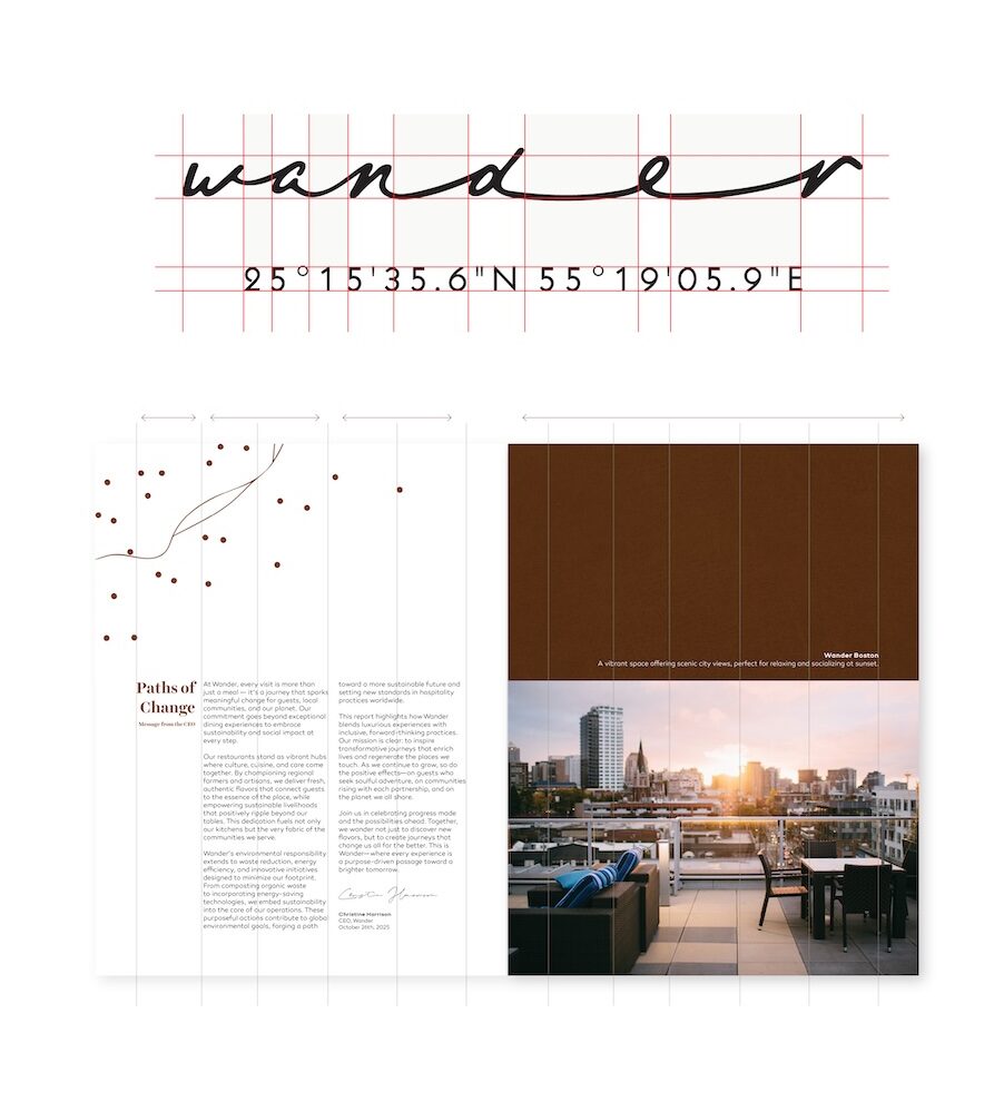
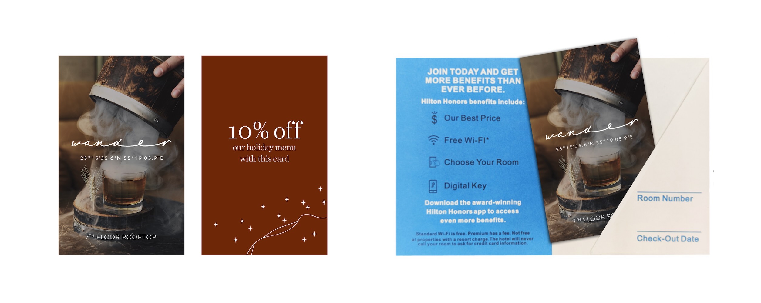
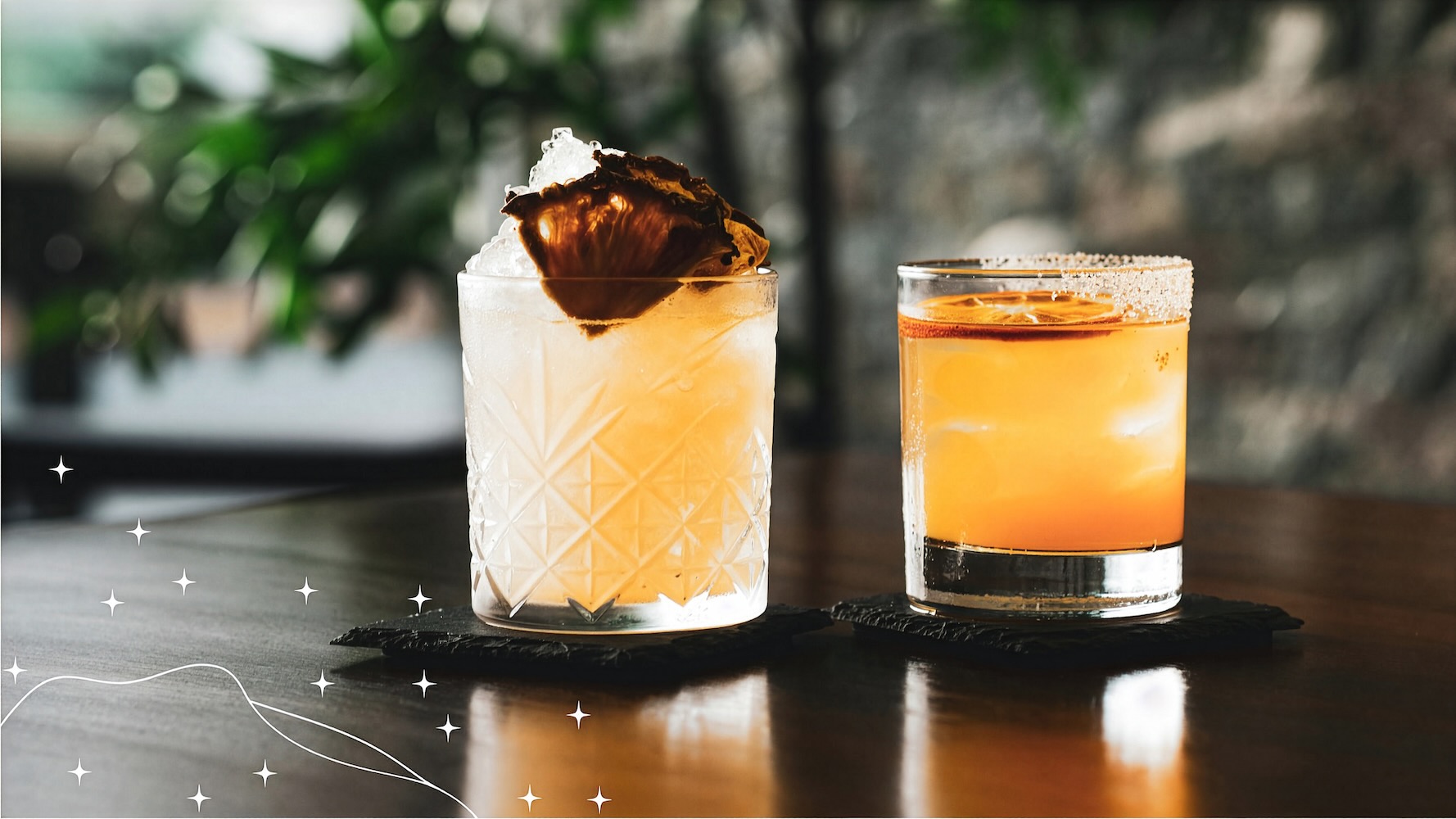
When I began designing a seasonal menu, I looked for a way to acknowledge the season while working alongside the existing menu design. My goal was that the updates would blend in so well that they felt invisible. I transformed the dots into stars, and added a seasonal colour called smoked chestnut to the existing palette.
Hex #6E2707
RGB 110, 39, 7
CMYK 0, 65, 94, 57